
Case Study · Brand Identity · Denver, CO
GROW
HOUSE
Floors 4 & 5, Trinity Place
"They had two floors, a name, and no brand. We built everything else."
A brand-new coworking space inside a 17-story office tower with no identity and no website. We built the full brand system, voice, and landing page from scratch — designed to convert visitors into booked tours on day one.
Client
Homeland
Building
Trinity Place
Deliverables
Brand + Web + Voice + Marketing Assets
Live Site
1801nbroadway.com/growhouse
Brand Identity System
Logo · Color · Type · Voice
Landing Page
Web Design & Development
Your coffee shop
days are over.
We saved you
a desk.
Print Collateral
Lobby Banner · Trinity Place
A brand built to grow into something bigger.
Grow House didn't exist yet. There was a floor plan, two floors inside Trinity Place, and a name. Ninth Degree built everything else.
The brief was to create a brand identity system that felt at home inside a 17-story boutique office tower, but also engineered to scale. Because the long-term vision for Grow House isn't a single location. It's a brand that could expand to other buildings, other cities, other markets.
So we built it that way. A logo system, a color palette, a type hierarchy, a voice. All designed to live inside Trinity Place today and stand alone tomorrow.
The Challenge
Sub-Brand Today.
Standalone Brand Tomorrow.
Grow House needed to feel like a sibling to Trinity Place, sharing DNA with a formal, architectural brand, while still having its own distinct identity, energy, and personality.
That's a hard balance. Too close and it disappears into Trinity. Too far and it feels disconnected from the building it lives in.
We also had to think past the first location. If Grow House expands to a second building, or a fifth, the brand needed to be built on a foundation that could carry that weight. Not a one-off design. A system.
Build a distinct identity
Without breaking from its parent brand, Trinity Place.
Write a voice from scratch
Direct, grounded, proud. Nothing like generic coworking.
Design for scale
One location today. A system built for wherever it goes next.
Brand Identity System
Every Mark. Every Color. Every Word.
We built the full identity from scratch: logo system, color palette, typography, voice guidelines, and usage rules. The result is a brand that can walk into any room on its own.
The Logo
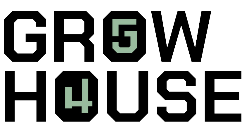
The logo system centers on the wordmark GROW HOUSE rendered in Chakra Petch Bold, a blocky, athletic typeface chosen specifically because its letterforms make the trick possible. In Chakra Petch, the G looks like a 5 and the H looks like a 4. That's not a coincidence. It's the whole idea. The O in Grow and the O in House are replaced with 5 and 4, embedding the floor numbers directly into the brand name. The "54" identity mark then works as a standalone badge across physical and digital applications.
The Letterform Trick
The 5 sits above the 4 in the mark because Floor 5 is above Floor 4. The hierarchy is literal.

G looks like a 5 in Chakra Petch

H looks like a 4 in Chakra Petch
PRIMARY WORDMARK / ON DARK
PRIMARY WORDMARK / ON LIGHT

54 BADGE MARK / ON DARK

54 / THE FLOOR CODE / IDENTITY MARK
Color Palette
The palette was built to feel athletic and urban. Nothing precious, nothing corporate. Growhouse Sage anchors the brand with warmth and distinction. Near Black gives it weight. Denver Rust is the exclamation point, used sparingly, landing hard.
#a0baa0
Growhouse Sage
Primary Brand Color
#0d0d0d
Near Black
Primary Dark
#f5f3ef
Off White
Background
#c44a2a
Denver Rust
Accent / CTA
#4a5a6a
Steel Blue
Supporting
Typography
Three fonts. Each with a job. Chakra Petch for headlines: blocky, athletic, commanding. Barlow Condensed ExtraBold for subheads and labels: utilitarian and clear. Space Mono for body copy and data details: grounded and readable.
Chakra Petch Bold
Gg
Headlines & Logo
Barlow Condensed
Gg
Subheads & Labels
Space Mono
Gg
Body & Data
Web Design & Development
A Full Site. Built Inside Another Brand.
The Grow House landing page lives at 1801nbroadway.com/growhouse, a fully branded sub-page inside the Trinity Place site. It shares the Trinity header and footer, but the moment you hit the Grow House section, you're in a completely different brand world.
The page was designed and built to convert, optimized for tour request conversions. Sections include About, Memberships, Space Showcase, and a Tour Request form. Every button on the page anchors to the contact form.
Full landing page built inside Trinity Place site architecture
Tour request form with 6 fields (name, email, phone, company, team size, notes)
Grow House fonts, colors, and layout system, completely distinct from Trinity Place
All CTAs anchor scroll to the form
Anchor nav linking About / Memberships / Spaces / Contact
Mobile responsive throughout
Print & Collateral
The Brand in the Real World.
Good brand systems don't stop at the screen. The Grow House identity was designed to work in the physical world from day one.
The retractable banner stand, deployed in the Trinity Place lobby at 1801 N Broadway, was one of the first pieces of print collateral produced. It puts the brand in front of everyone walking through the building: Trinity tenants, visitors, and prospects.
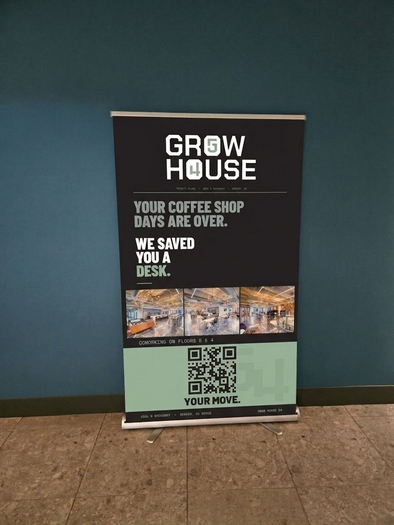
Deployed in the Trinity Place lobby on opening week.
Lobby Signage System
The banner system was designed to scale. Same layout logic applies to any Grow House location. Drop in new photography, update the floor numbers, and the brand translates immediately.
Designed to Scale
The Long Game
One Location. One System.
Built for Wherever It Goes Next.
This is what separates a brand from a logo.
Grow House launched at Trinity Place. But every decision we made in the brand system — the logo construction, the color palette, the type choices, the "54" floor code concept — was made with expansion in mind.
The "54" isn't arbitrary. It's the address of the brand. Floors 5 and 4 at 1801 N Broadway, embedded directly into the wordmark. That specificity is the point. It roots Grow House in a real place, a real building, a real community.
And because it's a system, not a one-off logo, it's built to carry that same sense of place wherever Grow House goes next. The floor code changes. The brand doesn't.
0 → 1
Complete brand and website built from nothing
54
The floor code that became the brand's signature identity mark
∞
A brand system designed to scale to any location
Up Next
Ready to Build Something?
We're selective about who we work with. If you're serious about the long game, let's talk.